Unlocking The Power Of Colour in Commercial Photography
In the world of impactful commercial photography, every image tells a story, and one of the key storytellers is colour. And if you’ve followed my work for a while, you know I love to experiment and play with colour in my commercial work. Particularly in the Active Lifestyle & Commercial Fitness genres.
The strategic use of colour can evoke emotions, convey brand messages, and create a lasting impact on the audience. Understanding colour theory is essential for photographers seeking to elevate their work and make a memorable impression in the competitive commercial photography industry.


The Basics Of Colour Theory:
Colour theory is a framework that helps photographers comprehend the relationship between colours and how they can be combined to achieve visual harmony. The three primary elements of colour theory are:
Hue:
The basic colour itself (e.g., red, blue, yellow).
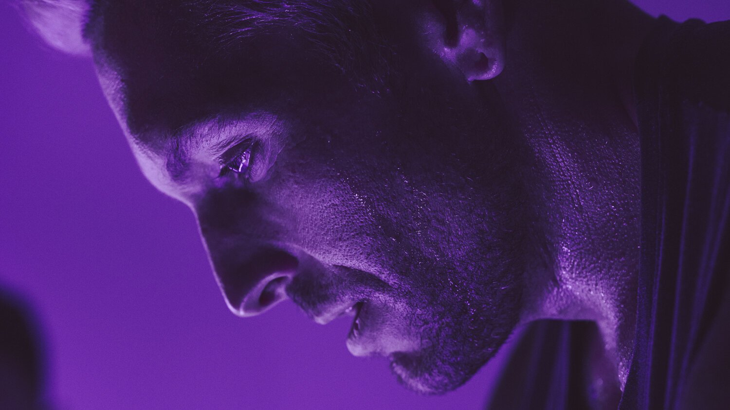
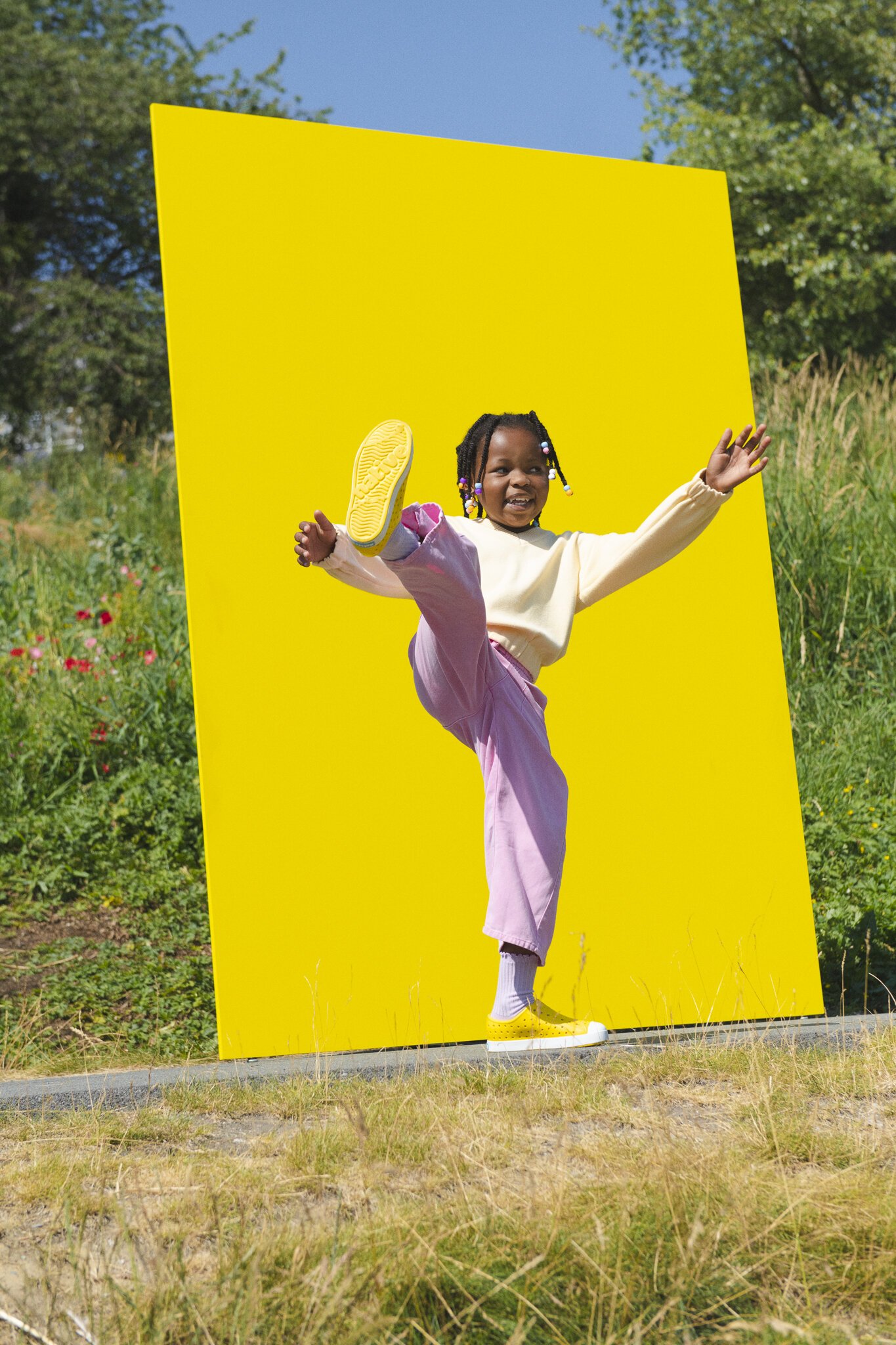
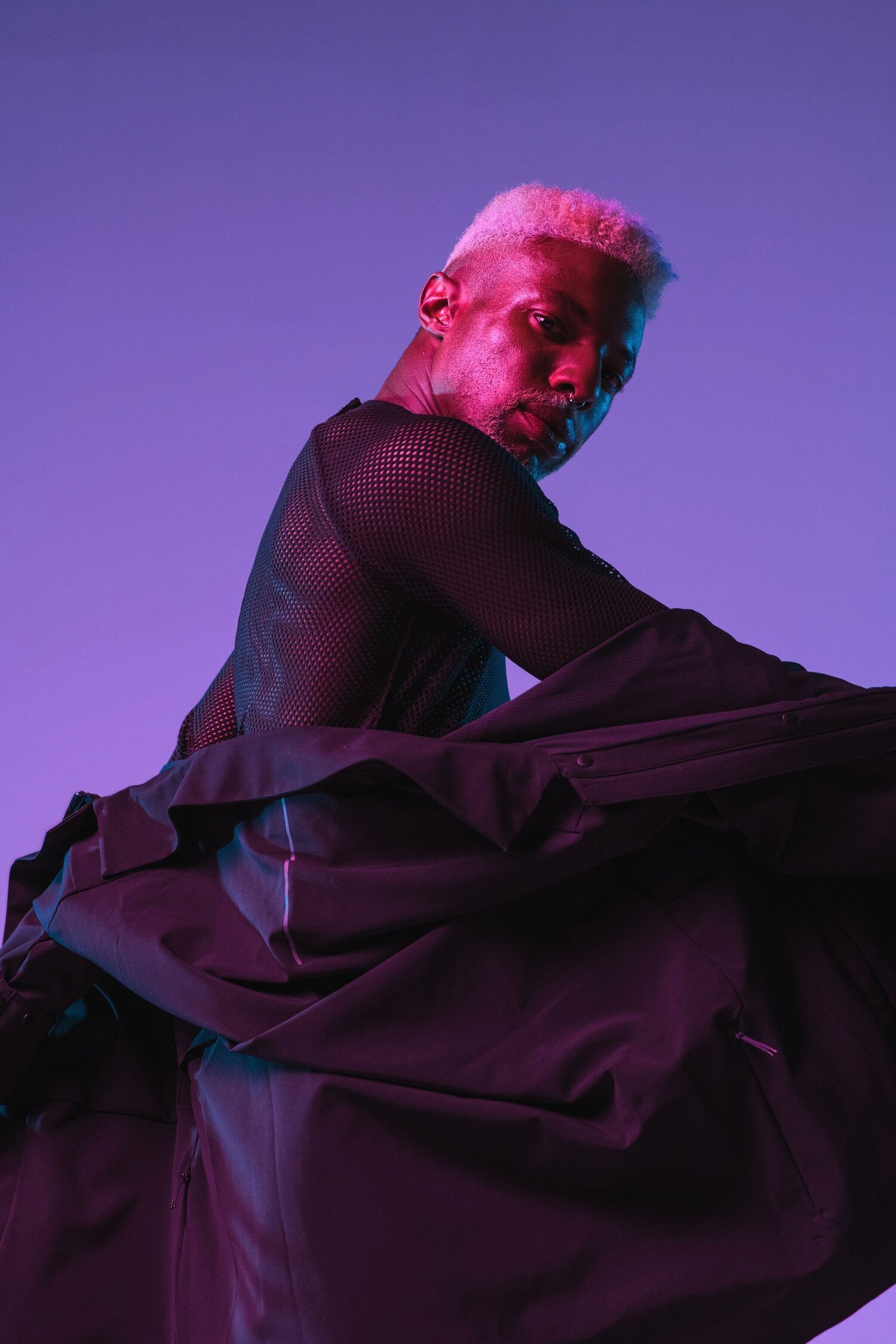
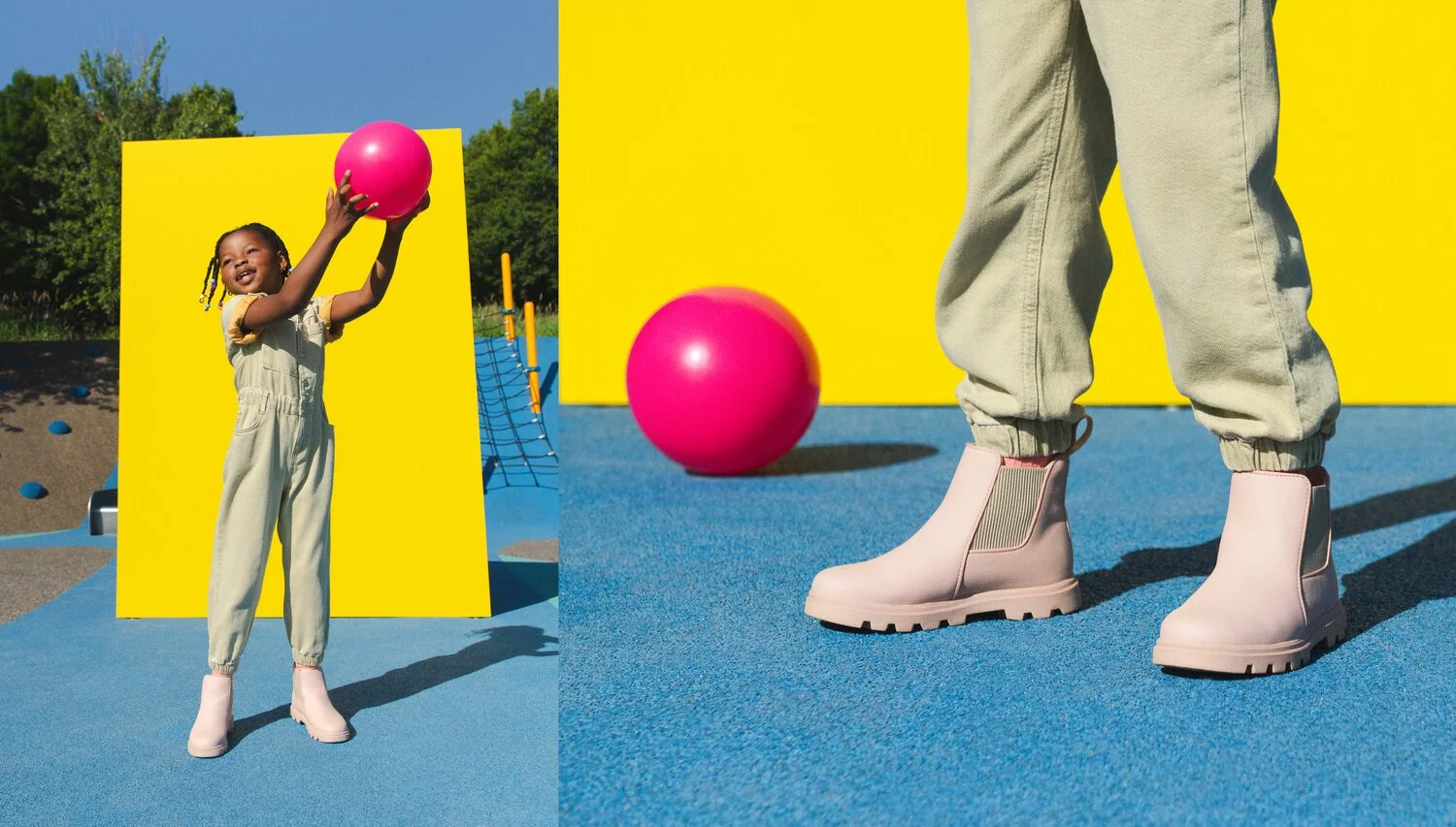
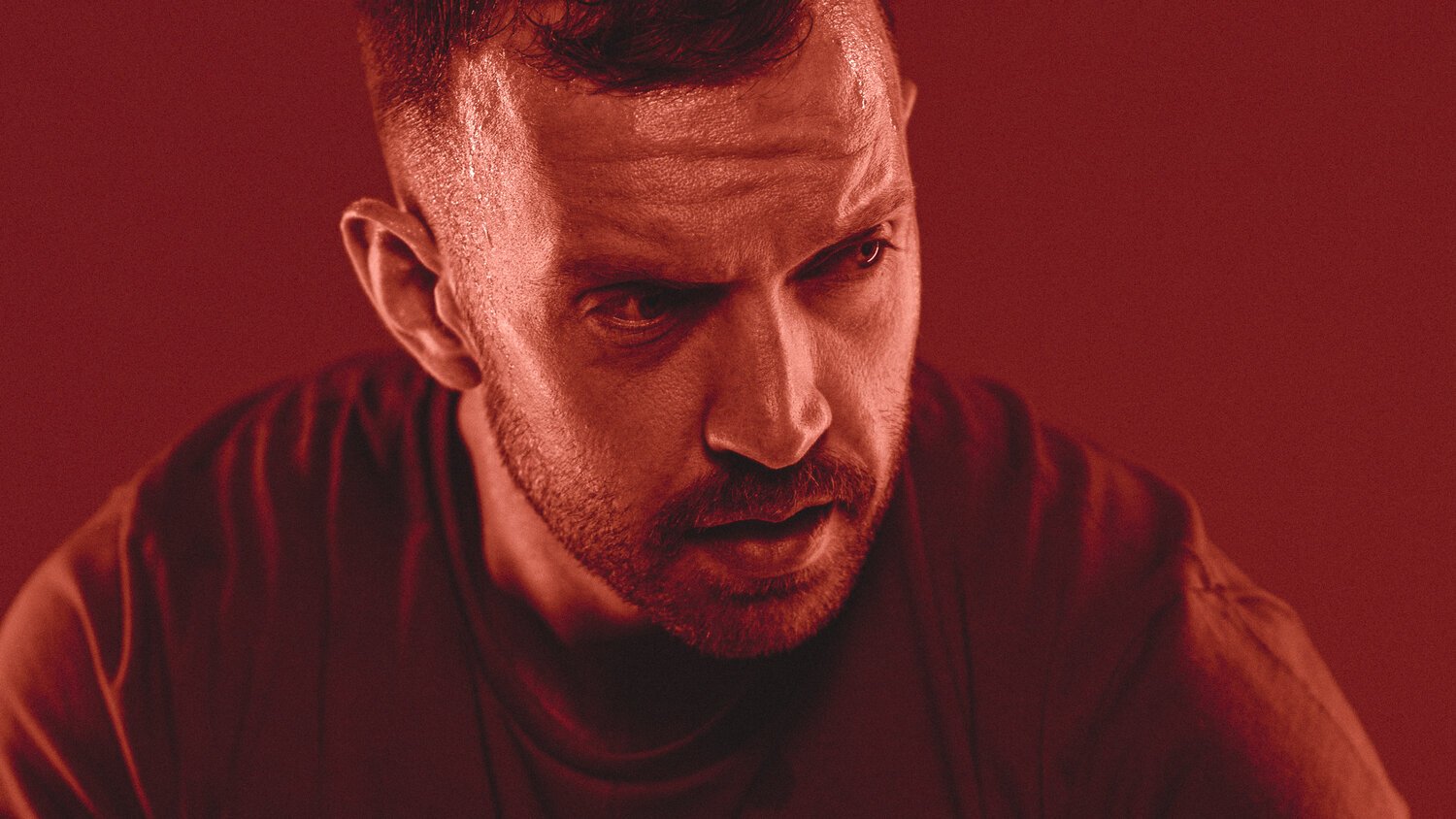
In commercial photography, selecting the right hue can influence the mood and perception of the image. Warm hues like red and orange can evoke feelings of energy and passion, while cooler hues like blue and green can create a sense of calm and tranquility.
Saturation:
The intensity or vividness of a colour.
Adjusting saturation levels can impact the overall mood of the photograph. High saturation is often associated with vibrancy and excitement, while desaturation can create a more subdued and sophisticated atmosphere.
Brightness (Value):
The lightness or darkness of a colour.
Proper management of brightness is crucial for achieving balance in a photograph. Well-exposed images with a good range of values contribute to a visually pleasing composition.

Application of colour Theory in Commercial Photography:
Brand Identity:
Understanding your client's brand and their associated colour story is essential for reinforcing their brand identity and for enhancing their brand recognition in their relative marketplace.
The very first thing I do in the consultation phase with any new client is getting them on a Brand Discovery Call to take a deep dive into their colour story.
Emotional Impact:
Different colours elicit different emotional responses. For example, using warmer tones can convey a sense of excitement and energy, while cooler tones may evoke calmness and professionalism.Have you ever noticed the ambient blue lighting in an aircraft cabin? It’s not an after thought!
Understanding these emotional associations allows photographers to tailor their colour choices to the intended message of the image.
Whilst rules can very much be broken, it’s always essential to keep the emotional impact of the intended audience (and paying client) in mind.
Composition and Contrast:
Colour theory plays a pivotal role in guiding the viewer's eye through an image - whether it be a still photograph or in motion video.
The strategic use of complementary or contrasting colours can highlight specific elements and create a dynamic visual impact.
Cultural Considerations:
Colours can - and do - carry cultural significance and meaning. A colour that conveys positivity in one culture may symbolize something completely different in another.
Likewise, photographers (in all genres) working in diverse markets need to be mindful of cultural interpretations as well as the impact of colour use on a range of skin tones to ensure their work resonates appropriately.
IN SUMMARY:
In the realm of commercial photography, mastering colour theory is not just about creating visually striking images, but also it’s about effectively communicating brand messages that have an emotional connection with the audience.
I encourage you to experiment wildly with colour theory in your work. Pick up a pack of gels. Explore the basics of Hue, Saturation and Brightness and see how mixing a variety of colours together can illicit different emotional responses!
And if this blog resonated with you, and if you’d like to take a deeper dive into colour theory or working with gels, sign up for my Newsletter below to receive dates and information on my next Photography Workshops.
Keep Creating, Ben
BEN OWENS PHOTOGRAPHY
Brand + Portrait
Live Well. Make It Count.
